
My process and approach for hand-tinting photographs has gotten a few people to ask about my process – how do I do it? What do they need to also do it? Now that I’ve had some time to experiment with a few different methods and refine my approach, here’s an outline of the process. Note that this is the process that I use, and you, dear reader – should you wish to create these types of painted photos for yourself – should find a process that works for you. This is presented as advise, guidance, and direction, not an absolute you-must-do-it-this-way-or-else. At the very least, I have made a considerable investment in time and monies to this (though such an investment pales in comparison to the time and monies invested in the photographic aspect of the art; camera and lenses are much more expensive than paints), and so you should take these instructions and adjust as your own time, budget, and skill set allow.
As a piece of general advise, if you are not already familiar with watercolor painting, I suggest you look into taking an introductory course on the topic. Find one at a local craft store, find one online, take an adult enrichment course at a local community college – whatever. Having a basic understanding of the principles will help you understand the choices I have made. Before starting this project, I hopped online and found several lecture series on one of the streaming sites I subscribe to, so I watched and followed along. While I knew some of the art aspect through photography (form and composition), the finer technical details of working with watercolor was something I had not learned and the courses on the subject were greatly appreciated. It also means that I am more confident in creating straight watercolor paintings, as well (not just producing the colored photographs).
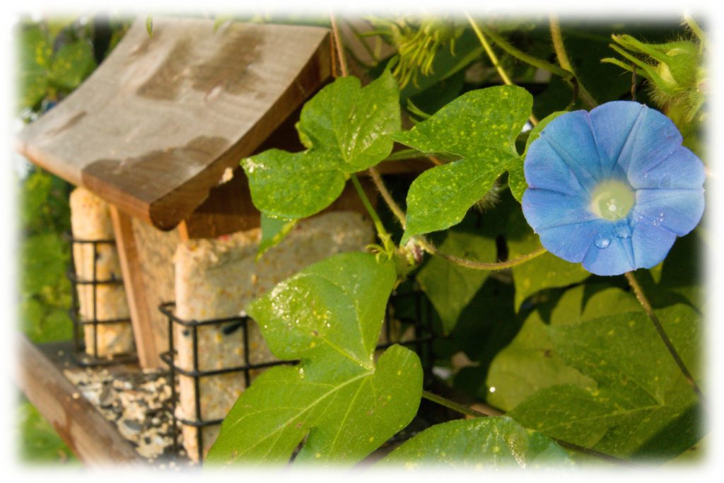
But back to the photographs. Of course, that’s where I start: with a photograph. I’ll walk us through an example with this photograph of a bird feeder and a Morning Glory from my backyard.

Since I take digital photographs, I have to do some conversions. If you are working from film or an existing photograph, scan in the photo first to work with it digitally – at the very least, you will need to be able to print it onto watercolor paper. I shoot in RAW format, so I first must digitally develop the photograph. This usually involves making sure the white balance and color profile are correct, cropping and leveling as needed, and exporting the file. Since I will be making additional edits, I export it in the TIFF format. My next step is to open the file in the GIMP and add a fuzzy border (usually a half-inch in width); this is entirely optional and is just a look that I prefer for the painted image.
I then convert the fuzzy-borderified image to black-and white. There are many methods of creating a black and white photo, and I have found that my preferred setting is the “Creamtone” preset in Lightroom – unfortunately, I do not know how to translate that to other image editors such as the GIMP, so if you do not have Lightroom you will have to experiment with the tools and processes you have to find a black and white image that you can work with.
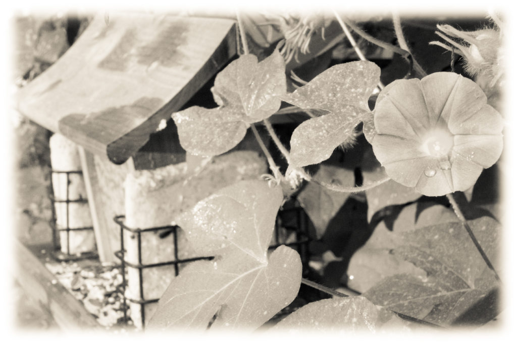
Once I have the black and white image, I print the photo. I use my photo printer (ink jet) and print on watercolor paper. I tend to use 140 lb wood pulp paper because it is cheap (Canson XL is the brand and type I use), although for this example I am using 100% cotton paper just to see how it behaves (this is Canson Aquarelle, 140lb). I usually also print the original color photo onto a 4×6 for reference. The fancy term for the sprayed ink (and the art print as a whole) from an ink jet printer is giclée (zhee-KLAY; French for “that which is sprayed”), and I will use that to refer to the print from here on, mostly because “giclée” is shorter than “the sprayed-on printer ink.”
As a note, you cannot print onto the paper using a laser printer – the toner just slides right off. I know. I’ve tried.
Once I have the giclée printed, I let it dry for at least an hour (that’s probably a bit of overkill, but the ink does need time to dry; it will get muddied if I try to paint over it straight from the printer). During this time I can put it in my stretching frame clamp, but can’t do much of anything else. What in the world is a stretching frame clamp? It’s something of my own design that really needs a better name, but it solves one of the big problems with this approach to painting printed photos – the fact that watercolor paper buckles when it gets wet. I will describe the construction of this in great detail below, but if you are not interested, I’ll move on in describing my process for now.
Once the ink is dry, I am ready to paint. At this point, the painting is really just a great big paint-by-number, so I’ll discuss my paint and color selections more than specific technique. I use artist-quality tube paints because they tend to be more transparent and more permanent than the cheap entry-level/kids paint sets. (Also, the really cheap sets tend to be gummier, leaving more brush strokes – something I’m not always looking for). Specifically, I use mostly Daniel Smith watercolors, although any quality watercolors should work (Winsor & Newton are more widely available, so I do have a few tubes of those colors). I personally prefer tubes over pans, but that is a remnant of watercolor painting as a kid – all the paint would mix together on the cakes because I didn’t know how to clean my brush properly. For any individual painting, I try to limit my palette to just a few colors and mix what I need to from there. Yes, that was something I learned from those watercolor courses I mentioned. Yes, I am just echoing it back. But yes, I agree with it – I get much better results from four or five basic colors that I mix together than from having two dozen separate colors. I don’t shy away from convenience colors – I love Sap Green – but I mix to get the colors I need for a particular painting.
I don’t try to match the colors exactly. If that’s what you want, just print the giclée and be done with it. Matching colors exactly is an exercise in frustration – doubly so for me. Not only does the ink already on the paper affect the colors selected, I have the added difficulty of having slight-but-noticeable protanomolous color vision. Basically, I’m slightly color blind in that red is not as bright and noticeable for me as it is for other people. As a result, I am likely to know that the color is not quite right, but where other people would know to add red, that is not the solution I would think of. Still, I try for a reasonable approximation of the colors and refer to my reference photo as needed.
For this painting, I selected French Ultramarine, Quinacridone Gold, Quinacridone Rose, and Cobalt Blue (one of my Winsor and Newton colors) for my palette. Quin Gold is really warm sunshine color, and since this is a morning shot, I wanted to invoke that feeling. I mixed the French Ultramarine and Quin Gold (with just the barest touch of the Quin Rose to mute it a little bit) to produce a green for the leaves and then added a much larger touch (but not too much) of the Quin Red to create a soft warm brown for the bird feeder. The Morning Glory flower really stands out, so I used the Cobalt Blue on it, but once the paint dried I added just the slightest touch of a glaze of a Quin Rose / Quin Gold mixture to add just that touch of morning warmth. For the suet and bird seed, I added a dab or two of Hansa Yellow Light into the warm brown to brighten it up a bit

As I said, this is basically a big paint by number – I simply wash the areas of the painting with color where appropriate. The differences in tonal value are accounted for by the giclée, so I don’t have to mix up specific colors for those. I do have to be careful in laying down the colors so they don’t mingle, so there is a fair bit of adding colors and then letting them dry before adding in a neighboring color. Since this is watercolor, I work light-to-dark, so for this painting I painted the suet first, the flower next, the bird feeder after that, and the leaves last. I tend to paint fairly dry, since too much water will still cause some runs in the giclée. This will cause some unevenness in color, so I go back with a clear water glaze to even out the color as needed. This wasn’t too much of an issue for this painting. I’ll go in and add in a few watercolor effects once the painting is done – for this painting, I added a water bloom on the flower and some darker blooms on the side wall of the bird feeder.
Use what brushes you are comfortable with. My general-purpose brush is a #8 pointed round, but if there’s a sky in the painting I’ll usually use a 3/4″ or even a 1″ flat wash.
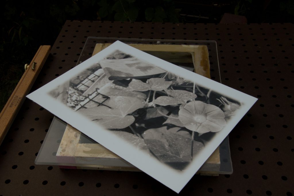
Once the coloring is done, I let the picture dry completely before removing it from the stretching frame clamp. Even though I feel slightly pompous and ridiculous doing so, I sign it (a gen pen works well for this) and then it’s ready for matting and framing.
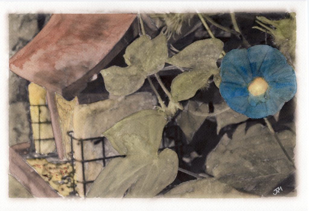
Normally I would go back and review the photo at this point. I think that the morning glory needs a little bit of work – the color selection is a little bit off. Perhaps I should just go with the straight blue, or find a slightly different blue (perhaps I’ll try a phthalo blue). Maybe I shouldn’t glaze it. The nice part of this is I can always print out another giclée and try it again. For this example, though, it will do.
The 100% cotton watercolor paper was nice enough to work on, but I didn’t really notice a significant difference between it and the wood pulp paper. If anything, I felt it buckled in the center more while I was painting (but it flattened out again as it dried). The frame clamp work by holding down the edges – I’ll have to continue to work on it and see if I can find a way to prevent center-buckle. But since it dries flat, that’s not a huge priority – I just have to take that into account and allow more drying time mid-painting. The cotton paper does have a nicer texture for the finished painting, through. Perhaps I’ll use some of it on a standard watercolor painting and see the difference there.
That’s it. If you don’t need to know about the stretching frame clamp, you can stop reading now. But if you are interested in a solution to a watercolor problem, read on.
The stretching frame clamp, as I noted above, is an alternative solution to the problem of watercolor paper buckling. Traditionally, you can overcome this problem in one of two ways: using paper from a block or stretching your paper before painting.
A block of paper is simply a pad of paper that is glued most of the way around (instead of along just one edge as traditional pads are). This glue keeps the paper flat while painting, and you remove the paper from the block only once the painting is finished and dry. However, I can’t run a block of paper through my photo printer.
The second solution, stretching paper, involves soaking the paper in water and then smoothing it out on and taping it down to the painting surface. This approach is useful for loose sheets of watercolor paper and paper from watercolor pads, but it has the problem that the giclée will run if exposed to a lot of water.
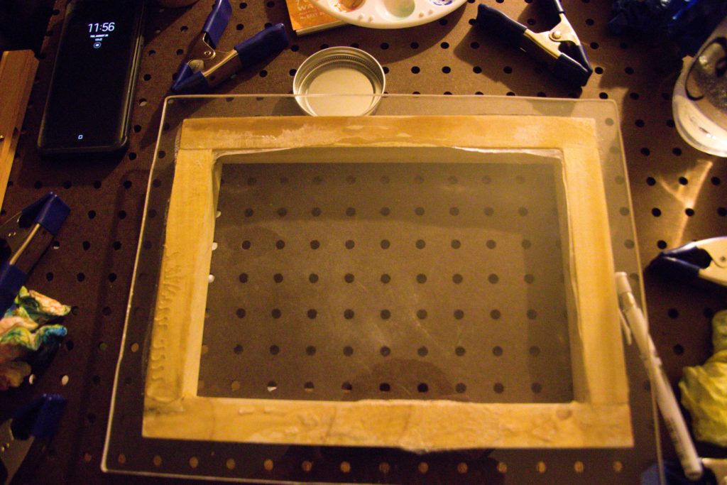
Since neither solution was possible for my technique, my first many attempts at paintings had considerable buckle once they dried. I made several attempts at solving this problem to various degrees of success, but had no real solution until I came up with my stretching frame clamp. This approach takes some inspiration from looking at the Otto System and inferring how it works, but it has its differences. I will describe how I built mine using Plexiglass, but you can do something similar in wood. The resulting tool can be used for any watercolor painting – it doesn’t have to be watercolor over giclée. But when giclée is involved, this tool (or something like it) is necessary to prevent the buckling.
To start, I cut two pieces of .20″ thick Plexiglass to be two inches larger in each dimension than my paper. A Dremel and a straight edge were essential in doing this; be sure to water-cool the Plexiglass and the Dremel bit (I broke one in doing the cutting when I forgot to keep it cool). I just used a garden sprayer with water in it and occasionally sprayed the Plexiglass and the bit. Since I mostly use 9×12″ paper, I cut the plexiglass to 11×14″. I designated one of the sheets the “backing board” and the other the “frame;” I took the “frame” and cut out the middle, leaving an actual frame 1 1/2″ wide (just like you were cutting a mat for matting your artwork). Sand and round the edges on both sheets; I used 80-grit sandpaper. Learn from my mistakes and wear gloves for the Plexiglass work – acrylic splinters hurt (and can be hard to remove).
I then took some 1″ square wooden rods and cut them to to make a frame roughly the size of my paper (7″ and 12″ in length in this case, to make a 9×12″ frame). I glued and clamped the frame together, let it dry, gave it a very light sanding, and then epoxied it to one side of the backing board so that it was roughly centered. I let that dry, then attached it to a piece of 24×24″ pegboard (I simply screwed it on from the back of the pegboard into the wooden frame).
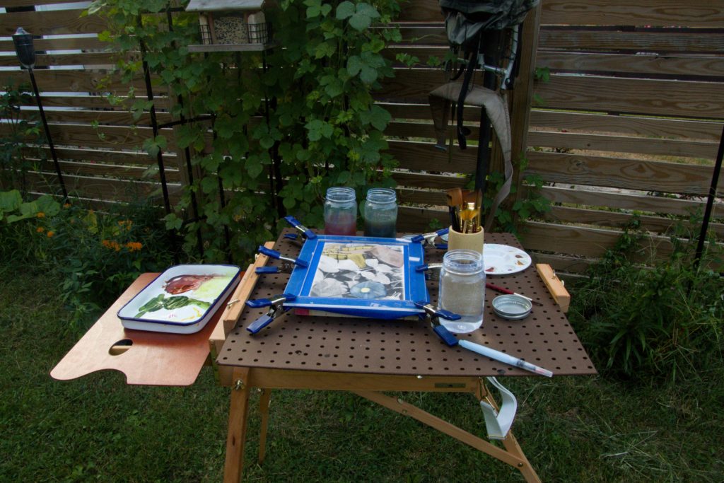
To put the paper in the clamp, I place in on the backing board (roughly where I can see the wooden from through the Plexiglass), tape it down with some blue painters’ tape (if needed – this is for mostly for masking the edges, not holding it stretched), and then put the clear frame over top. I then use spring clamps to hold the frame to the backing board, sandwiching the paper in between and keeping it stretched while I paint. See the below photo for how that looks.
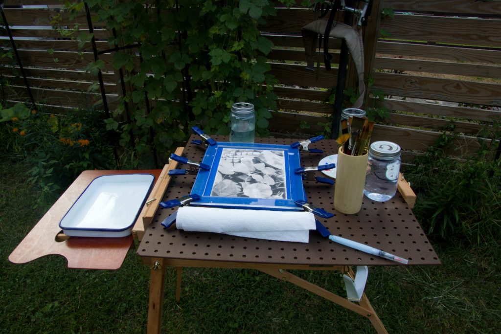
That’s it. The pegboard fits onto my easel and gives me a working surface (I generally paint watercolor on a horizontal surface, and like having the “table” right there). The wooden frame lifts the backing board away from the pegboard, allowing room for the spring clamps. It also serves a a rough guide on where to position the paper. The backing board gives a nice smooth surface to put the paper on, and the frame and the clamps do all the hard work of keeping the buckle away. Just like any buckle-prevention system, you do have to wait for the water to dry completely before removing it, or else you will get some buckle.
I’m sure that I will make various refinements and improvements as time goes on (I already want to replace the screws that hold the frame to the pegboard with hanger bolts, so that I can use the same pegboard and swap out what frame is attached to it). Maybe I’ll do more with the pegboard, as well – bolt on brush holder, water holder, paper towel holder, etc. But for now, this needs my immediate needs and seems to meet it quite well.
Hopefully this will provide the necessary guidance for people looking to do something similar. If you do, make it your own, and let me know if you find things that work better. I’m always looking for improvements.